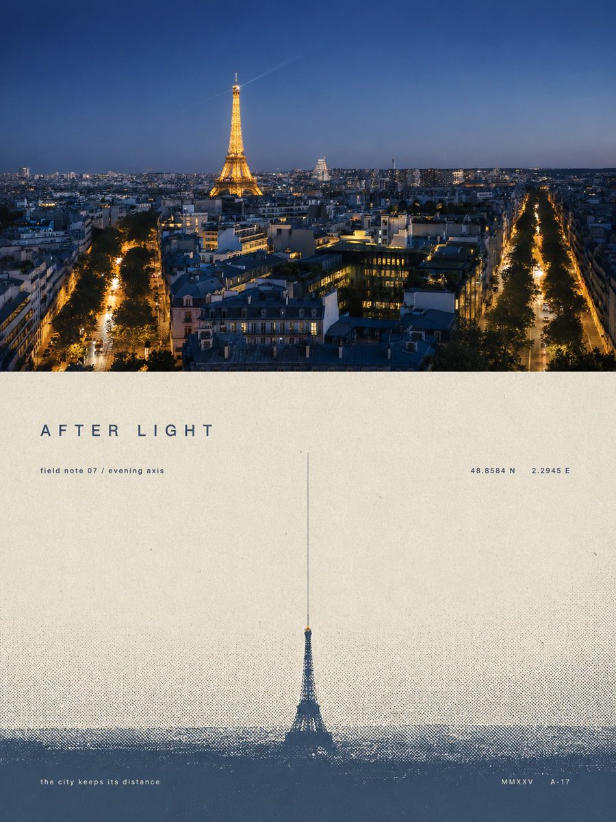
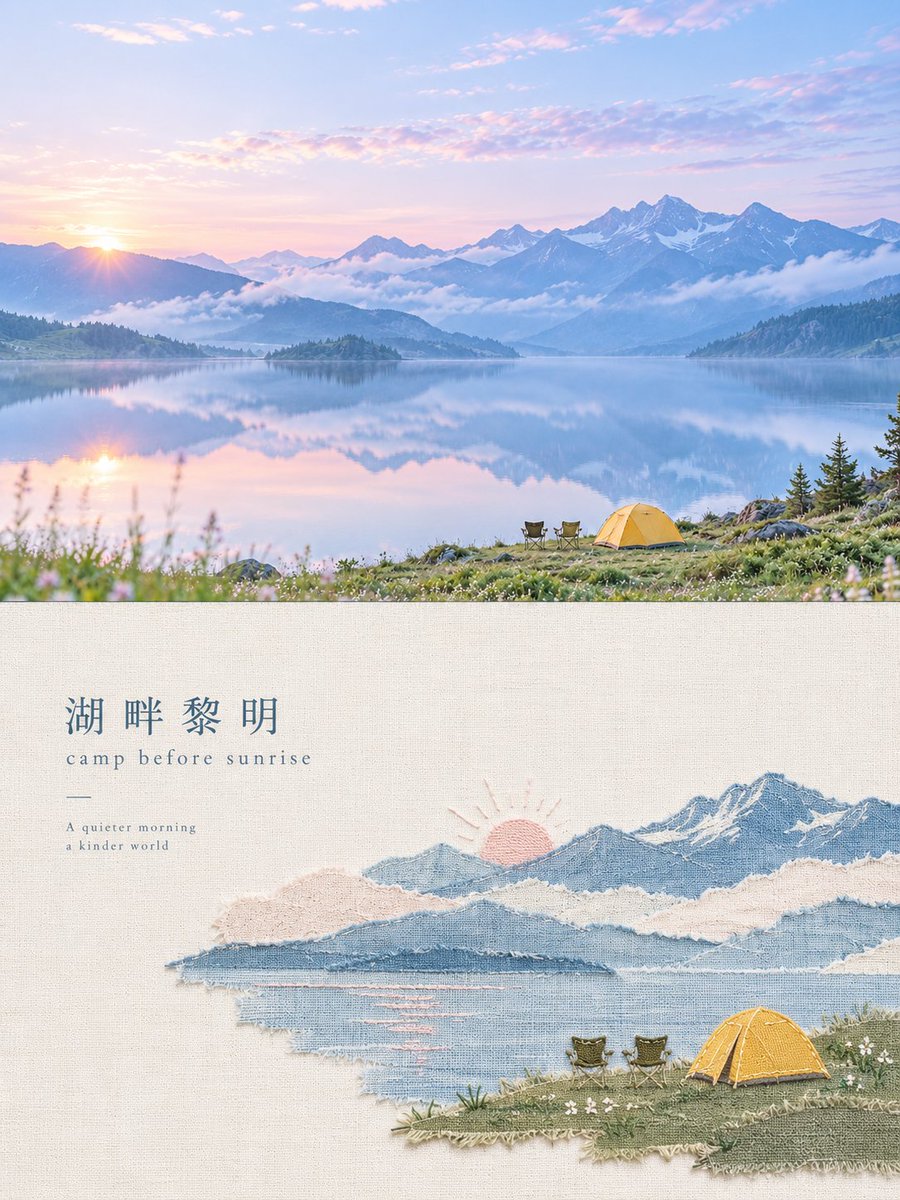
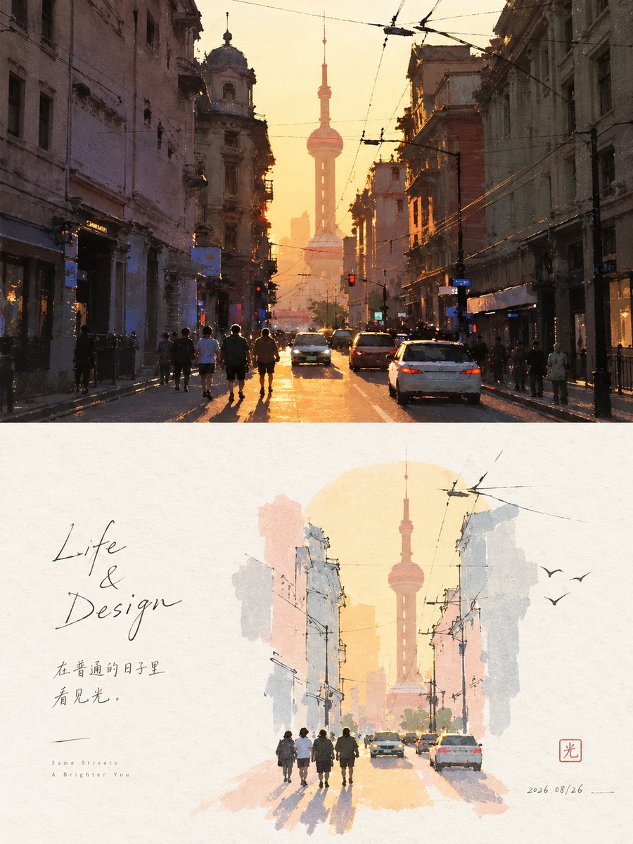
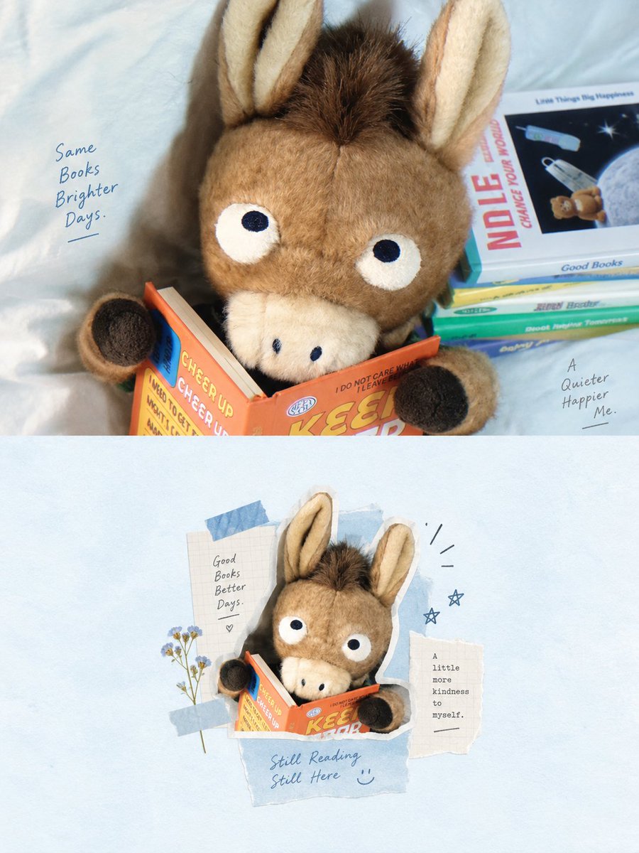
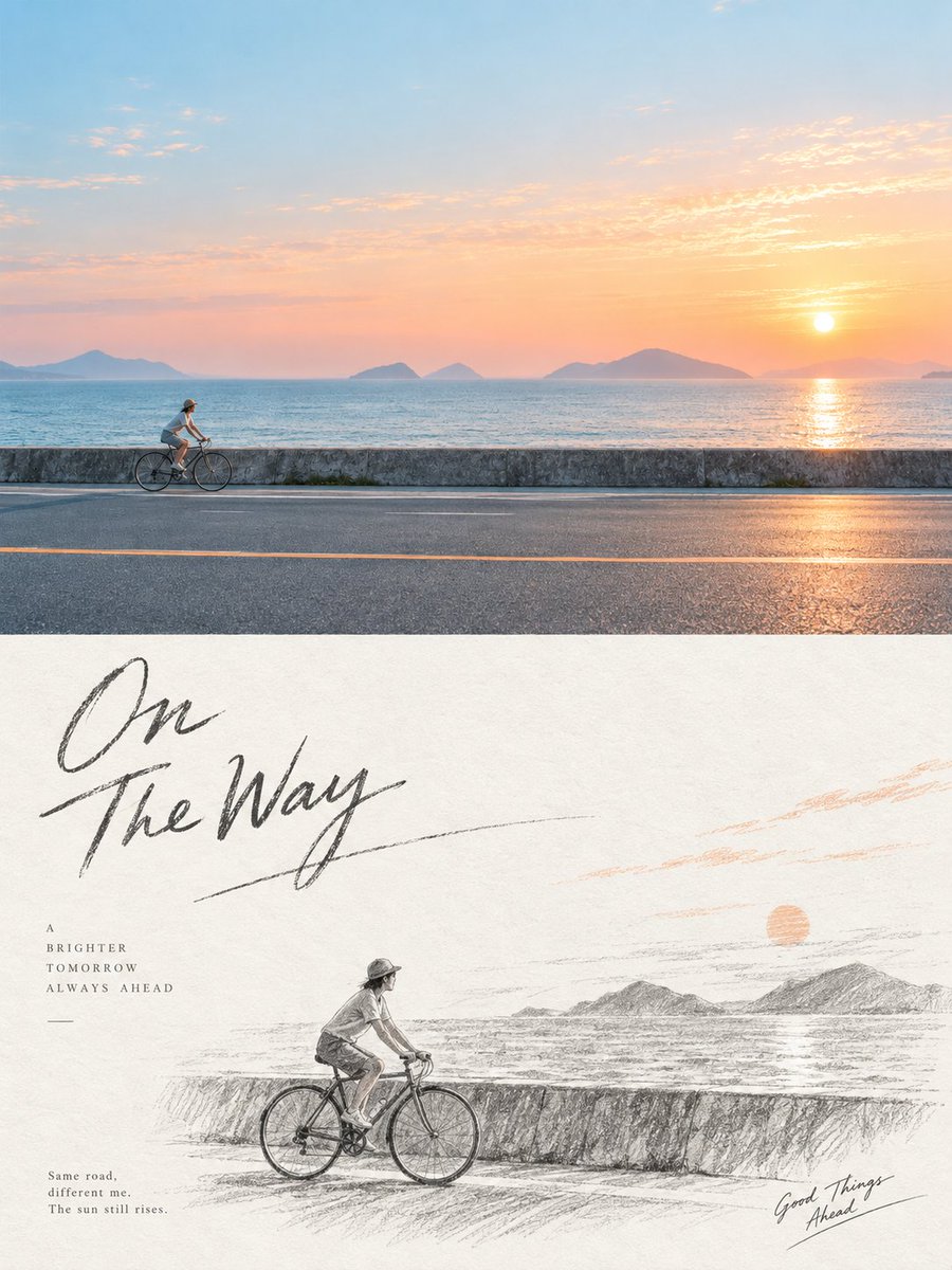
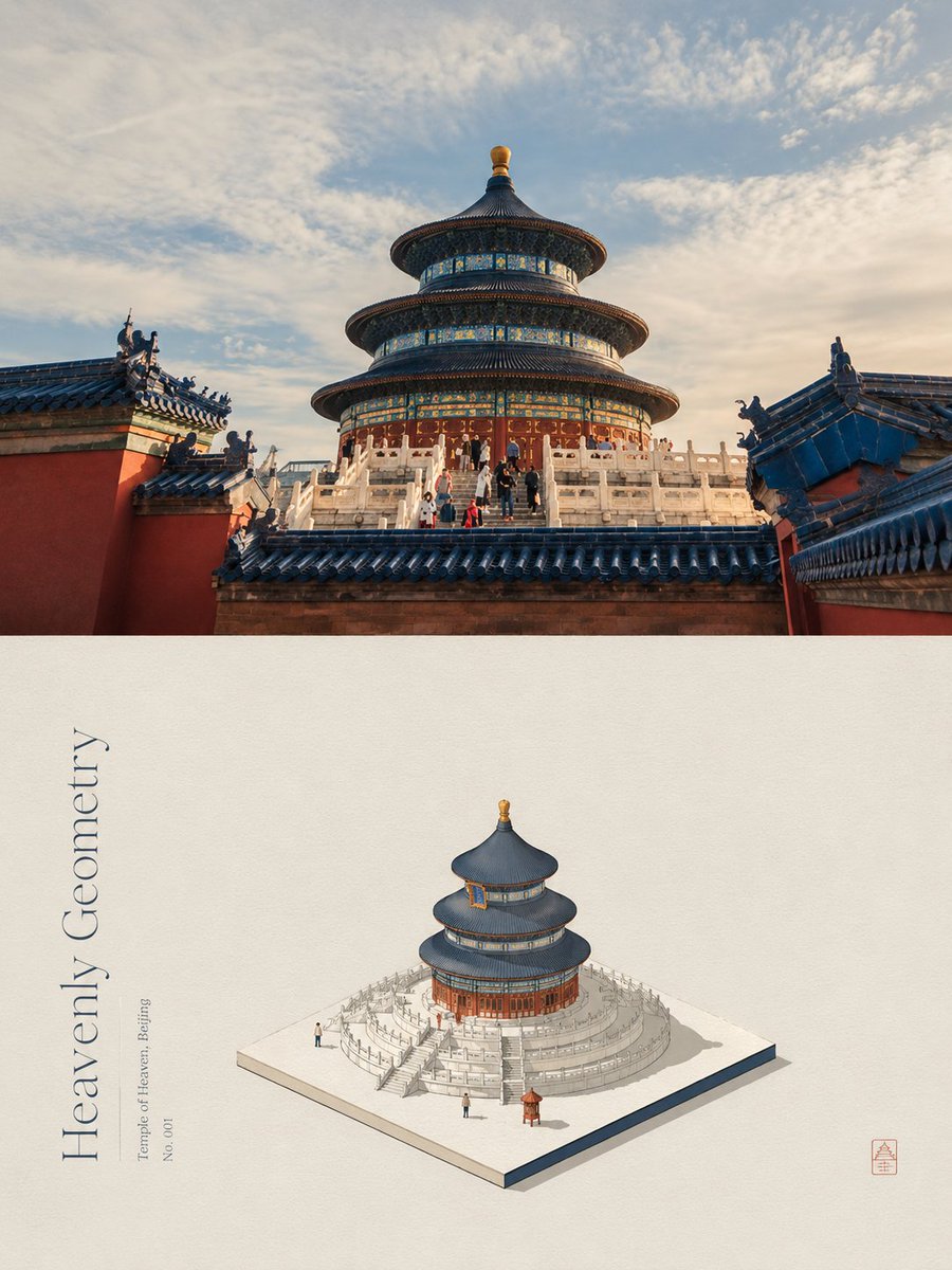
An image-to-image design prompt that creates a 3:4 layout dividing the original image and a stylized typography design that masks elements from the original…
Please transform each photo I upload into an independent, premium design poster, without multi-image stitching, outputting each photo separately. The overall layout adopts a {argument name="layout ratio" default="3:4"} vertical composition, where the upper and lower sections are strictly equal at a 1:1 ratio, each taking up 50% of the canvas.

The upper half retains the original photo, preserving the identity, structure, posture, realistic texture, natural lighting, and original color atmosphere of the main subject, with only subtle premium color grading applied to give it the aesthetic quality of an art magazine, independent publication, or exhibition image. To fit the aspect ratio, the environmental background can be naturally extended, but the subject must not be stretched, distorted, or altered.

The lower half extracts only the most recognizable subject, outlines, structures, postures, and narrative relationships from the photo, reapplying artistic judgment to reconstruct it into a conceptual poster centered on kinetic typography, typography masking, and type-image integration. Do not copy the photo completely, nor simply stuff the entire photo inside the text; instead, eliminate most of the background and irrelevant information, retaining only the most critical visual memory points so that the subject maintains a clear correspondence with the photo above.

Freely extract a short, visually powerful word or phrase based on the theme of the original image, with no language restrictions. The text itself becomes the primary compositional framework of the lower half: embed the subject imagery into the glyphs via Typography Masking / Extended Letterform, and extend, slice, elongate, displace, or structurally reorganize the brushstrokes so that the glyph simultaneously serves as a window, boundary, path, column, or spatial framework. The subject can partially burst out of the letterforms, intersecting, connecting, or overlapping with the text, making the 'type' and 'image' truly function as a unified whole, rather than just a title added onto a picture.

The composition emphasizes positive/negative space and large amounts of intentional white space. The text and subject concentrate to form a clear visual core, while the remaining areas are boldly left blank; elements can be off-center, aligned to the edges, suspended, or partially cropped according to the subject's direction, proportion, and visual center of gravity. Re-direct the frame through glyph scale, stroke extension, figure-ground reversal, and whitespace relationships—even if the original background is cluttered or the subject is small, it must be transformed into a viable piece of art through deletion, reorganization, and scale adjustments. Reflections, mirrored extensions, or distorted refractions should only be used if the original image has corresponding water, glass, ground, or spatial relationships, and should not be forced.

The color palette retains the most memorable and vibrant color relationships from the photo above, subtly brightened, purified, and cleared of muddiness; the imagery inside the glyphs can retain more vivid primary colors, while the exterior forms a large breathing space using warm white, {argument name="background base color" default="cream white"}, or an extremely pale background intelligently matched to the original image's comprehensive color temperature. The overall colors should be clean, lightweight, and visually striking without being overly gaudy, avoiding dark, muddy, dirty, or cheap filter effects.

Apart from the core glyphs, only a minimal amount of secondary text information is permitted, utilizing slender, cool fonts that possess a sense of modern editorial order and slight experimental layout sensibility, quietly positioned in the white space, along glyph edges, or structural axes to establish scale contrast and reading rhythm with the main glyphs.

The final output presents a high-end visual effect of Typographic Photo Manipulation / Experimental Typography Poster / Type–Image Integration, specifically highlighting glyph extension, font masking, type-image fusion, positive and negative forms, massive white space, and spatial illusions. Avoid basic photo-in-text fills, full scene replication, text stacking, complex backgrounds, commercial title templates, and cheap compositing looks.